Wednesday 23 February 2011

From Fast to Long

Huge amount of excitement in the knit corner on the catwalk:

MARK FAST
Exquisite nude knits that ripple and. Fast incorporates leather alongside his trademark wool wonders. Shape, volume and shoulders are key to his avant-garde creations. I love that the colours are based on the farmer's paint on a sheep's wool; black and natural white and he livens them up with a splash of orange. A wolf in sheep's clothing so he says...


JAMES LONG
This is his S/S collection which I want want want!


Tuesday 22 February 2011

and the colours keep on coming...

Simply in love with ERDEM

S/S 11 - Beautiful. Hazy, coral, underwater colours - Stunning confectionery sweet lace and tulle mixed with blood red roses and floral fantasies. 

AW/11

In contrast to his heavenly prints above, Erdem has transferred to the dark side producing a sultry, sexy collection of rich and opulent fabrics. Still as decadent, luxurious and breathtaking as ever.


Monday 21 February 2011

LFW

Okay so I'm busy researching and drawing for my new project 'TRANSITION' but I have been getting very very distracted by all the new designs that have been bouncing along the catwalk this week. I only wish I could have got tickets! 


DAY 1: 
 
THE RODNIK BAND - who knew urinals could be cool...


DAY 2

LOUISE GRAY - Now that's what I call a lot of layering, powerful punchy mix match colour art attack! Cheeky & childish - tartan, balloon headgear and patchwork parkas.
 
DAY 3:
HELLO MATTHEW! Flamboyant and wild. Bold Russian style prints - wow


VIVIENNE WESTWOOD RED LABEL - Here's hoping she designs Kate and Williams attire for their wedding day - wouldn't that be a royal treat. 

Loving the new Comic Relief tees aswell
Images:http://www.londonfashionweek.co.uk

Tuesday 8 February 2011

Reflective Statement

TASK:

Write a 200- 300  word reflective statement that sums up what you feel you have learnt during this unit and how well you think you have done on your blog – evaluate your own blog – its strengths and weaknesses. 

Criteria:

Research: Systematic identification and investigation of appropriate sources
Analysis: Examination and interpretation of resources
Subject knowledge:Understanding and application of subject knowledge and underlying principles
Experimentation: Problem solving, risk taking, experimentation and testing of ideas and materials in the realisation of concepts.

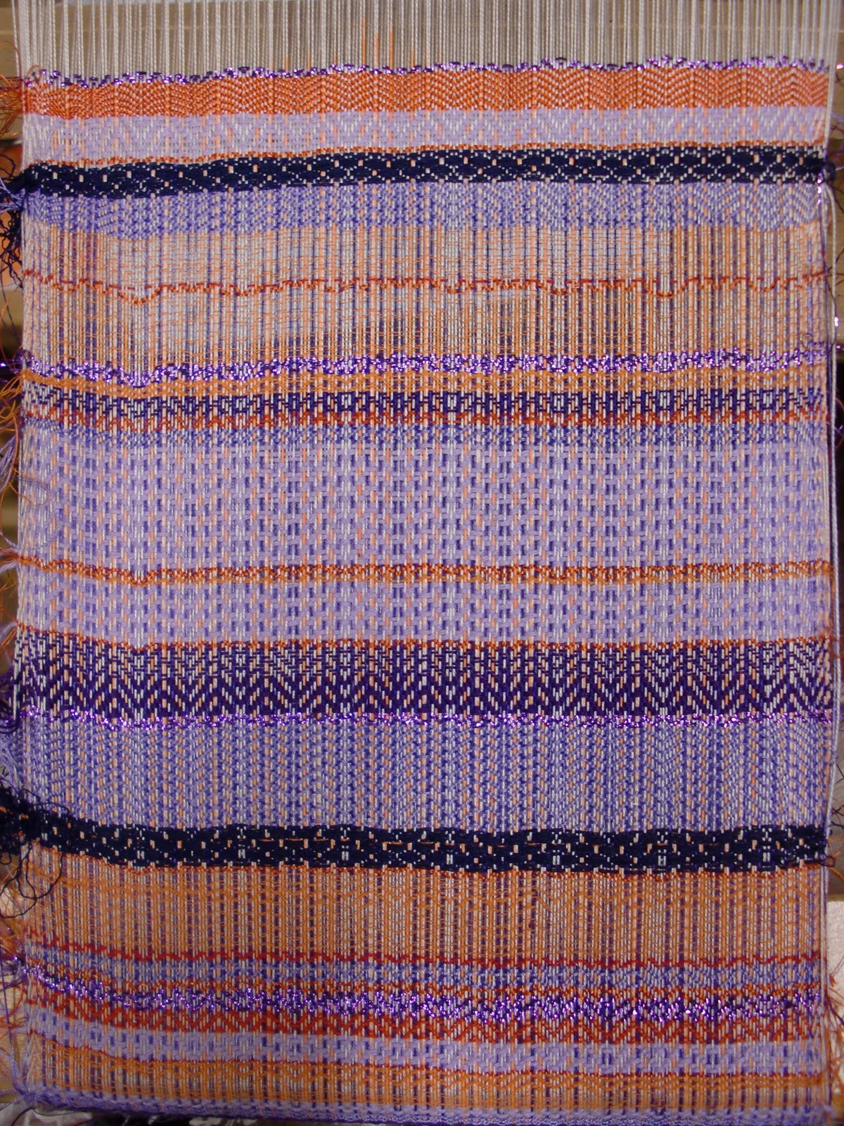
Arriving in London I found the Rough Guide project helpful in allowing me to explore new sights/destinations. I have learnt that research is vital in ensuring an informative project and have learnt the relevance of designers in inspiring new techniques and trends. Furthermore, if I analyse and reflect upon my work as I go along then I am able to make quicker, more efficient decisions. I have also learnt the importance of time management and documentation and that drawing is essential in all projects. I think the workshops and inductions have been helpful in showing me what facilities Chelsea has to offer, thus where I can broaden my skills. The winding and wrapping workshop has also been useful in showing me how to use colour to correctly interpret my drawings.
Blogging is a personal way to share all of my ideas and processes, and although I started quite slowly I feel I have thrown myself into creating an interesting archive of galleries and exhibitions that I have seen over the past few months. I have managed to organise myself and schedule time to write up all of my winter study tasks/visits and hope to stay on top of it. I think I have successfully met the criteria, researching all of the exhibitions, analysing artist’s works and reflecting upon whether I think they were good/bad. I follow many blogs (Dazeddigital, fashiontoast, lefashionimage, Jak&Jil, Spoton: Textiles…) and have realised that the simplistic ones are the most effective. I am most fond of Scott Schuman’s blog; The Sartorialist because he displays his works in a clear, concise way with no flashing backgrounds or soundtracks, directing the viewer to his effortlessly, beautiful photographs. I have chosen a similar, readable layout allowing my text/images to speak for themselves. I realise I often babble thus I aim to produce more succinct posts in the future. I have also started displaying images of my drawings/college work thus portraying my interests, inspirations and influences. I hope to use my blog as a showcase for expanding my artist repertoire, displaying an exciting and engaging, encyclopaedia of images, designers and popular culture and I hope by doing this I will illustrate what drives me individually and creatively.


Wednesday 2 February 2011

TECHNICAL BLOCKS 3 & 4

I then decided to change my collection in order to give me a new colour palette and different objects to work from. I know it would have formed a cohesive collection if I had used the same objects as before however I felt they had run their course and wanted a new source of inspiration. I first picked a small suitcase that I had and began filling it with items that one would need if they were to go travelling or exploring; sunglasses, maps, rope, passport, money, phone, flip-flops, magnifying glass etc. However, when it came to drawing this collection I found it quite difficult as they all had different properties and textures and thus translated quite badly onto paper.
I found that I was most interested in the colourful maps in the suitcase, so I collected a bunch of A-Z's with spiral ringbinders and distressed binds to draw. I twisted them into interesting shapes and emphasized their colourful pages, providing me with a vibrant, primary colour palette that would allow me to proceed into print and weave.


TECHNICAL BLOCK 3: PRINT

We began the block with a week of digital printing which involved an intense course of Adobe Photoshop. Having used Adobe before I thought I was pretty good at it, however, at the end of the first day I realised how wrong I was. After scanning in a couple of photos to work from I manipulated and used layers to create two designs that would later be printed onto silk scarves. I really enjoyed digital print as it allowed me to enhance my drawing skills and make my designs come to life.

(pics to come)

The second week of print began with using Adobe to create a flattened black and white image that could be transferred onto a screen for screen printing. Once we designed an image we then exposed our screen and using different pigments, highlighters and binders printed our images onto a mixture of cotton, silk and silk viscose. I loved dyeing the fabrics in the dye vat and using devore to burn my image through revealing one colour on the silk and another on the viscose. I could easily see myself doing print as I feel my drawings lend themselves well to the technical block, but I feel I would like to use stitch or knit alongside it.

Pink Illuminating dye on Purple dyed silk
 
 
 Pink and Purple dye devore on Silk Viscose

TECHNICAL BLOCK 4: WEAVE

After already enjoying the first 3 blocks I tried to rule out weave in my head. The idea didn't thrill me however as soon as I started I was soon caught up in the repetitive and compelling 'YARN, CHANGE, BEAT' rhythm. I loved painting the warps and thus controlling the exact colours that I used. It is quite a slow process as each pattern has a special code and sequence to follow meaning that different shafts have to be lifted or lowered each time. It was very satisfying seeing your weave develop and knowing that each line was specifically designed and thought of and that you were making a fabric from scratch. 
    I did feel it was quite restricting using the manual weave machines as once I had learnt the techniques I found that it wasn't as challenging as I would have liked. However, after seeing a 3rd years fashion garment I saw the potential of weave and how easily it could be translated into fashion or interiors. Digital weave also looked exciting as you can create a haven of wonderful patterns and colours by simply programming in one of your designs. There is also the option of printing an image onto the warps which I thought would be right up my street!


experimenting with plastics and bin liners
black and white warp with hand painted warps

 painting the warps
Adding wire and lycra to give shape to my sample
16 shaft loom - trickier and definitely more time consuming but beaaaautiful once finished!

Being ridiculously indecisive I now have the dilemma of deciding which block to choose. After enjoying all of them I know I have a tough decision to make but hopefully with the help of my new project 'TRANSITION' I can narrow down my choice.